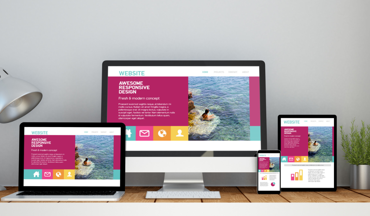
Mobile browsing is the future. There have been various studies over the past few years predicting an explosive growth in mobile browsing, and now that the iPhone and Blackberry devices have led the way in mobile browsing, the floodgates have opened. Mobile browsing is set to eat up a significant proportion of web browsing as a whole, so to capture that potential, your site needs to be optimised for mobile viewing. These top tips explain how your site can be better accessed on the go.
- Optimize for Slower Connections
Make sure when designing your site that most mobile users will not have the latest in technology, and so their connection will not be particularly fast. If your site takes too long to load on their mobile device, the chances are they will get bored and look elsewhere
- Reduce Image File Size
Images look fantastic on a website, but on a mobile device, they can be a pain. Users do not want to see huge gaps and crosses where their images should be, and may look elsewhere if this is all they see on your site. So, optimise your images so that they load faster, helping to deliver the goods to your mobile users.
- Avoid Flash
Flash might make for amazing graphics on a PC or laptop, but on smartphones and other mobile devices, Flash leads to crashes or just failures to load. iPhone, iPod and iPad do not support Flash, and with iPhone OS being the most popular operating system for smart mobile devices, you’ll alienate a huge proportion of viewers by using Flash.
- Don’t Rely on Video
The mantra in the early noughties was “Multimedia, multimedia, multimedia.” Yes, we know that PC users love to play with video, audio, games and other interactive tools, but with many users browsing on mobiles now, videos that take forever to load and then refuse to play properly on most devices are infuriating. Avoid using video content if you are aiming at mobile audiences.
- Keep it Slim
Websites designed without mobile browsing in mind often come up against horizontal overflow problems where users can’t see everything left to right and have to keep toggling horizontally. This is annoying for users. You can avoid this by designing your site in one central column, to keep things central for mobile users.
2. Make Navigation Really Simple
Mobile users will struggle to navigate your site if your navigation relies on clicking images, as these will take longer to load on slower connections. So, design the navigation and user journey depending as little as possible on images and plugins to make things smoother on mobiles.
- Optimize HTML
Use the most efficient, semantic HTML you can, and put more emphasis on presentation in your CSS. CSS is more powerful and doesn’t clutter your site with presentational data, so the site can be viewed by mobile users more easily.
- Lose the Special Effects
Dynamic effects simply don’t translate to most mobile browsers well. They do not add much to a site when viewed on a PC, and bring nothing but annoyance when users try to view your site on a mobile
- Control Text Sizes
Large text is unwieldy on a mobile device as the screen is so much smaller, and users have to scroll down through squashed-up words to get to body text. With this in mind, your large text headers should be no more than twice the size of your body text, and headlines should be as short as possible to avoid them spilling over into several lines on a mobile device.
- Write for Mobile Users
The majority of mobile browser users, according to mobile operator Orange, feel that there should be specific content for mobile rather than the same content as on web pages. If you’re planning to go down this route, remember that you shouldn’t just change the structure and features of your mobile content; you need to edit the actual words as well. Mobile users are more likely to be on the go when they access your site, and so have less time to read, and there’s also the problem of a lack of space. So, your copy for mobile should be as concise and punchy as possible.


